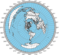

This all started when I was interested in calculating the distance and bearing between amateur radio stations. I found this reference on calculating the great circle distance and bearing. Ultimately, this interest led to a web form for producing azimuthal maps.
For those who never heard of an azimuthal map, it is a special kind of map that prioritizes correctly showing the great circle distance and bearing from the center reference point. Azimuthal maps are particularly useful for ham radio operators with a directional antenna. For example, if you’re in Connecticut and you want to talk with someone in Cameroon (Africa), the azimuthal map will tell you to point your antenna to a bearing of 90° on a compass (technically you also must adjust for the difference between magnetic north and true north).
It occurred to me that this the bearing and distance calculation was the fundamental tool for making an azimuthal projection. All I needed was a database of land and political boundaries expressed in latitude/longitude pairs.
The azimuthal project is always made from a particular reference point on the globe, and I can convert the points in the land and political boundary database into bearing and distance using the great circle calculations. This gives me a collection of points in polar coordinates (r, Θ) which is what I need for the azimuthal projection.
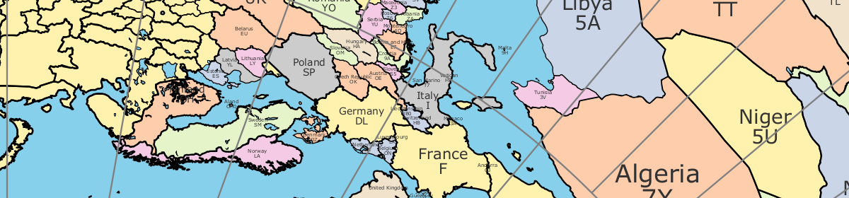
For the land and political boundary information, I used the database from the CIA World Databank II; however, it required some massaging. First it was too detailed, and I had to filter the data to an appropriate resolution. Next, I wanted land masses and water bodies to be represented by closed paths. The CIA World Databank II is a collection of unconnected paths, so I had to write a program to patch them together and reorder the points to be clockwise. Having closed paths of points ordered in clockwise orders is necessary to have water and land colored differently. Lastly, I had to identify which closed paths represent land and which represent water. Unfortunately, this work is incomplete. You’ll notice some lakes that aren’t colored blue.
Initially, my Ruby program was generating raw PostScript. However, I recognized that it would be easier for people to use if it generated a PDF. Rather than using a Postscript to PDF convertor, I changed to generating PDFs directly using the Ruby PDF::Writer. By using PostScript or PDF, I get vector graphic output that is scalable from small to very large sizes without having to make a huge raster graphic files. There is a limit to the resolution of the continent & political outline data, so at very large sizes, the outlines may not appear smooth.
Ultimately, I used the great circle distance formula from Wikipedia. According the article, it’s accurate for both long and short distances.
The hardest part of the whole project was getting the water blue. There are still some maps where the program gets it wrong, and you’ll see weird coloring. Things tend to go wrong when the reference point is inside a particular small region of land or water. In these cases, the floating point accuracy seems to cause the colors approach to fail.
My plans for future improvements include:
- add small tables of bearing & distance for important world cities around the margins
- add US and world cities to the map (particularly for area map)
- adjusting political boundaries and labels to be more accurate
- adding more views to allow people to report lakes that aren’t colored correctly
I am using an Apple , when I download , it will not open , tried 3 times , in trying it will appear to be there but tells me to pick a program to open with , there is no suggestion on the site what to open with .
Thanks anyway , John
I modified the server a little to set the Content-Disposition HTTP header to save the map to a filename ending with
.pdf. I hope this modification will solve this problem.I can’t view the map. XP, IE6, recent Adobe. ??
Several others on QRZ have same problem. K8ERV
I sometimes have problems with the browser plugin. Can you try turning off the “view in browser” option? Save the file and rename it to “map.pdf” or something ending in .pdf. Let me know if that helps.
Just a note. I generated a map for EM38un, and turned off ‘blue background’, just to see what a B&W map might look like. It looked great, except for two (blue) bodies of water which appear to be just north of Iran. Just thought you might want to be aware of this apparent glitch in a descriptive parameter somewhere. Many thanks! Neat tool. 73 – Tom N0SS
Technically, the blue background switch controls whether the large oceans are blue. The black and white switch controls whether lakes are colored blue. Perhaps, this is confusing.
Good Site.
I generated a map from PM06db, 10000 km range, with blue background turned off. Unfortunately, it seems as if the Asian coastline has disappeared! The national borders inside Asia appear fine, as does the Caspian Sea, and the coastline of North America.
I see what you mean. There is definitely a bug for PM06db for 10000 range. I’ll try to look at it tonight. Some parts of the map generation are guided by heuristics, so there are situations where it makes the wrong decision. The map rendering starts with the longest paths, and the path for boundary for Asia, Europe, and Africa is the longest path. My suspicion is that another path fill is erasing the boundary of Asia, Europe, and Africa.
I should add, thanks for the service! It’s a great tool. 73!
I ran another map from PM06db, again 10000 km range, this time with the blue background turned on. The Asian coastline is still missing, and with the background on, it fills North America with blue.
I still think it’s very useful! 73!
The bug for a map with location PM06db/distance 10000 has been fixed. Thanks for reporting the problem!
Would not open. using XP
Have you tried deselecting the View in Browser selection? It should save the PDF to your computer.
Hi, Cannot open “Create Map” comes up with =
HTTP 500 Internal Server Error – Indicates server problem.
Thank you, will keep trying. 73, John Alcorn VK2JWA
Hi, Server has solved it’s problems. Program works great!!
TKU VRI much. 73, John VK2JWA
Hi Tom, great program, no trouble generating quite nice maps for Sydney (QF56oc, Aust.) and Tartu (Estonia).
Funny tho’, Canberra seems to be missing (bit like forgetting Washington?) Looking closer at New Zealand…it seems their South Island has been renamed to “Norfolk Island” (it [N.I.] is a tiny speck, closer to VK-land and a bit further north too), dunno what the Kiwis’ll think. Might there be a glitch in locating the text?
Have you thought about opening up the grid-centre? It obliterates city/town names when it’s close/on-top. It’s more noticeable with 30(deg) angles than the 90, 45, 22.5,… the salty folks use (dropping E–W for 20*char-width might be a work-around)
TNX, 73 de VK2NQ
Thanks for the feedback. To figure out the details of what’s going on, I need to know the location (QF56oc) and the distance. For city names, I start with the most populous cities first and avoid printing names on top of each other. It may not be listing Canberra because the name would collide with a larger Australian city. The same thing can potentially happen with Washington DC. Regarding Norfolk Island, I am kind of at the mercy of the databases I have access to, but it is listed in Wikipedia: http://en.wikipedia.org/wiki/Norfolk_Island
Hi
I generated a number of maps from 47 49 02N 12 38 17E. The maps seemed Ok except for limited range. It is from between 1175km and 1190km to between 2610km and 2625km. The land masses are blue and the water white with some islands being also white.
I hope this helps you toward your perfect product.
Barry
Thanks for reporting the issues. There are some situations where the map generator has to use heuristics to guess which area to fill white and which to fill blue. It makes the right decision most of the time, but there are situations where it is wrong. I am busy this weekend with a jamboree on the air, so it might be a while before I have a chance to look at this particular problem.
Hi again Tom, following up April 16,2010.
My location in QF56oc is in the middle of Sydney, less than ~5km south of the geographic survey datum point. I use my gps to get locators so I’ll have to check to see if the datum is in QF56oc. ?Distance, from/to?
Canberra is about 300km [SW by S] as seen from Sydney [century-old politics dictated its position, roughly half-way between Sydney and Melbourne, so labels would be unlikely to clash even for ZL- or ZA-land which would rotate them to N-S from E-W]. Its the largest inland city.
The wikipedia entry’s map shows Norfolk Island in its correct place, 2/3 of the way to New Caledonia from NZ, nowhere near New Zealand’s South Island where its label appears on the maps centred at QF56oc (Sydney)and on Tartu, Estonia. Looks like the data-base coordinates for Norfolk Is have moved it from 29.03°S 167.95°E to around 43°31′48″S 172°37′13″E [Christchurch, South Island, NZ](source Wikipedia)
73 de VK2NQ
Thanks ! The GC map centred here (Lipsi) looks fine. One minor glitch; although I ticked ‘Black & White’ The Great lakes, a couple of VE ones, the Caspian & L. Baikal are blue.
Thanks again & QAC – Mort
Yeah, I haven’t implemented that feature correctly yet. Sorry.
Typo ! E-mail is of course g2jl@arrl.net… SRI +
500 Server Error
A misconfiguration on the server caused a hiccup. Check the server logs, fix the problem, then try again. URL: http://ns6t.net/azimuth/code/azimuth.fcgi
Get message ‘500 Server error’ – no print.
Sometimes the web server gets overloaded, so try again. If it keeps happening, please send me the inputs you used when the `500 Server error’ appears.
Great program! Would you consider adding the option to plot grid squares on these maps? For example like the AZ_PROJ postscript program written by NA3T & NV3Z at http://www.wm7d.net/azproj.shtml
I’ll think about how to add grid squares to the maps. I can probably add it in the next few weeks if not sooner.
Thank you for a great tool Made several maps for HF and VHF contesting
73 Brock
I found a bug. I put in my qth and tell it a 100 mile map and it centers on Washington DC. I changed to a known local City that is close to me Fredericksburg, Va and it did it again zero in on Washington DC as the center of the map
When I tried to reproduce the Washington DC followed by Fredericksburg, VA bug, it works for me. The Fredericksburg map is centered on Fredericksburg. It might be a problem with caching somewhere between your browser and the server. Perhaps, unclicking view in browser might help.
I have a problem placing an antenna because of the height of the house and height restrictions on the antenna. I mapped the USA. Now I know where to put the antenna so there’s no masking by the structure. Thanks and 73!
If possable can you make a jpeg or gif of this map. What I can do then is to enlarge it using Rasterbation online and make it bigger for the wall of the shack. Instead of one page I could make it 4×4 pages to fit on the wall and have it as a full image.
A Google search of PDF to JPEG revealed many options. There are many options for page size, and the map scales fairly well as a PDF. I guess I don’t see the point of making a JPEG.
Tom,
My loss for taking so long to look up your work…this is an awesome tool! You have too many intellectual calories seeking an outlet 🙂
Jim
Tom,
One addition that may be usefull to some is a distance (range) notation. i.e. if you input 400 km for the radius, it also shows on the printout.
’73 Jim
Jim, thanks for the compliments. I can add labels for the distance.
Thank you so much. This worked out easily and well for me. Appreciate it very much.
73,
jojo
I use another one for vhf/uhf. The state names were too big so I left them out, but then lost state lines. Choice of cities seems to include unfamiliar places–like it finds something on each line, however small.
It does tend to fill up the space with cities.
Could you please to add some more information about longitude and latitude for local square e.g. KO92?
Why is it that the instructions tell you that you can enter teh name of a city, and when you enter a city, instead of a map, you get this:
Location must be either a Maidenhead grid square (e.g., IO91um)
or a latitude, longitude. Latitude/longitude can be specified by a pair
of signed floating point numbers separated by a comma (e.g., 51.504, -0.268),
or as space separated integers indicating degrees, minutes, and seconds
(e.g., 51 30 0N, 0 20 0W). In the third form, you can leave out the seconds
or minutes (e.g., 51N, 0 20W or 51 30N, 0 20W). The absolute value of
the latitude must be less than or equal to 90, and the absolute value
of longitude must be less than or equal to 180.
Someone please explain, as this is very misleading.
Sorry, it’s a situation where the error reporting text in the azimuthal map generation code isn’t up to date with the HTML help text. I think I improved this message.
Hello Tom ,
Thanks very much for this great page.
It has been very helpful.
Regards from Chile.
Richard
CE6RC
FF30
You may develop the variant an azimuth map, in which distances were displayed in logarithmic scale? In separate events this was comfortable look.
The challenge with making a logarithmic scale is that the log of zero is undefined, and the center is supposed to represent a distance of zero. Weird things would happen if a line on the map passed through the center.
Hi Tom, thanks for this amazing tool!
73,
Marcelo W8/XQ6BQ
Hi tom very good colleague’s own I’m trying, and using, until next time, good dx.
lw9ebx
Hey, great map generator, I plugged in my grid square and it generated a nice map Thanks great effort.
The azimuth mapper works just fine on my IPhone but I get a connection problem notice when I try to produce a map after filling in data on my PC. Windows XP. Your site fits the bill for custom sizing and concentric circles. Thanks-Ray-Seattle
I am glad to hear it works on an iPhone. I’ve never tried it on any mobile devices. Your problems making maps from a Windows XP PC are a mystery to me. Generating maps takes quite a while, so your PC browser might be timing out before the map starts sending.
Great program!
It works great on my laptop running 64 bit Window 7 and prints great on an old HP plotter.
Thank you!
Mike M / K1MJM
Excellent!
Works GREAT in IE browser, but would not open the map in Firefox 7. (This is not an issue for me, the actual map the page creates is fantastic – I just wanted to let you know)!
Thanks!!!
Perrin VK3XPT
This is great. I used it for maps centered on Los Angeles and Tokyo. Extremely helpful. THANKS!
I would like to make an azimuthal map for my location in Memphis, but have not figured out where to start doing it on your website. I see information on how you proceeded to create it, but do not see where to begin.
The azimuthal map tool is here: http://ns6t.net/azimuth/azimuth.html
congratulations for the excellent and useful program.
Thank you!
Fernando PY2NL
This is a great map resource! Very nice! Thank you. If there is anything that could be added it would be to be able to display callcodes (countrycodes) along woth country names. As a beginning ham I would find that very usefull.
/johan
Great program!
Congratulations!
Valdemir PY6BC
Steve,
Thanks for your efforts, I’ve printed wall sized versions of your maps that I use in VHF contests from the Sierra Foothills. My only request would be to have the option of outlining 4 character grid squares instead of the current 2 character ones.
Hello Tom!
I use on-line azimuthal map tool. It works perfect!
Some of my suggestions:
– include option to place ham radio prefixes instead of country names
– draw the border lines between former Yugoslav republics – Croatia, Slovenia, BiH, Montenegro, Kosovo
– the same situation – ex-USSR : Ukraine, Moldova, Russia etc
Best regards!
73! Victor / LZ1NY
Do you know of any online sources for the borders of former Yugoslav republics and ex-USSR?
Tnx!
Tom NS6T
Thanks for making this terrific resource available. Looks like it was a huge effort. Having only 8.5×11 printing capability, I could wish for a way to print it out in quadrants that could be taped together.
regards, Tony Smith
If you have a Kinkos nearby, they can print it at larger sizes.
It works very well.
It would be great to see the call sign prefixes for each country.
73, Al VE2AMT
Yes, call sign prefixes would be good. It’s on my to do list.
Hi Tom,
great cartographic work. I try several level of detail (radius) and I would be very interesting to know how you can place the name of city without conflict. IE overlays between two place names wich are very close to each other . Sorry for my english. hi.
Thanks! It sounds like you’re encouraging me to find a better name placement algorithm, but I am not positive. The approach I used was to consider each name as a rectangle and then avoid placing two rectangles on top of each other. It’s a conservative approach, but it’s relatively quick.
>It sounds like you’re encouraging me to find a better name placement algorithm
No! You found a very good way for placement! I’m using GMT for mapping and it’s always a big problem with “pstext” to do placement without overlays. Gongrats!
73 Pascal
Awesome!
Good job. This is a great map, very practic
Lw6dml Jose
This is GREAT!!!! Thanks.
However I would like to print a few distances for my HF station and VHF go kit for ARES so I have a feel for “range” on 75, 40, and 2M. Got charts displayed on the screen which will be helpful but I could not get them to print.